21 Choices Website
overview
This project was an exercise in redesigning a pre-existing website to improve usability, visual cohesion, and accessibility. I developed the skills needed to identify flaws in an existing interface, create low-fidelity and high-fidelity prototypes for various screen sizes, and build a responsive website based on those prototypes.
Timeline
September 2022 - October 2022
SKILLS
Visual Design, UX/UI Design, Lo-fi Wireframing, Hi-Fi Wireframing, Front-end Development, HTML/CSS
00. Goal
How can we improve the usability of the 21 Choices website?
01. Website Analysis
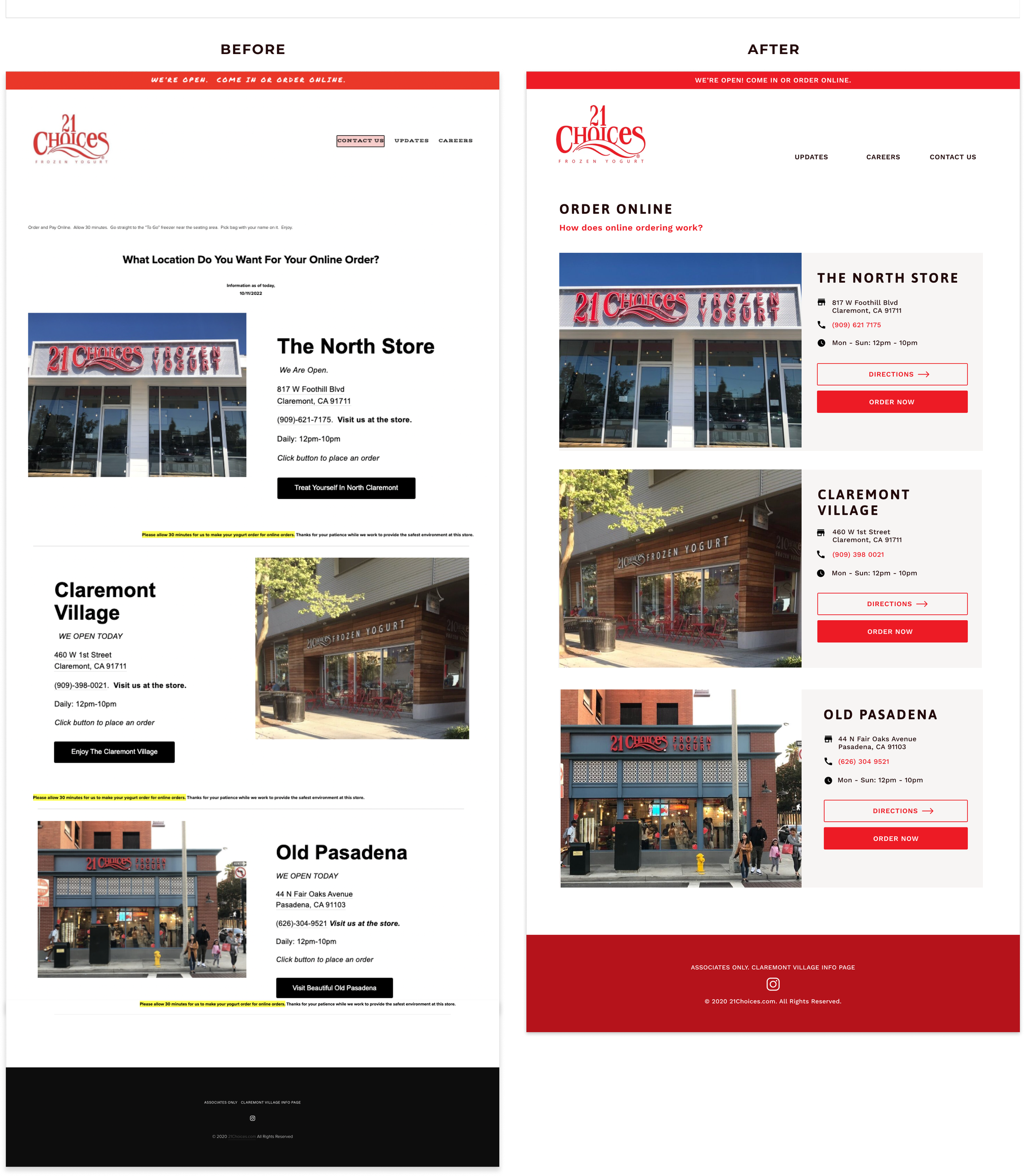
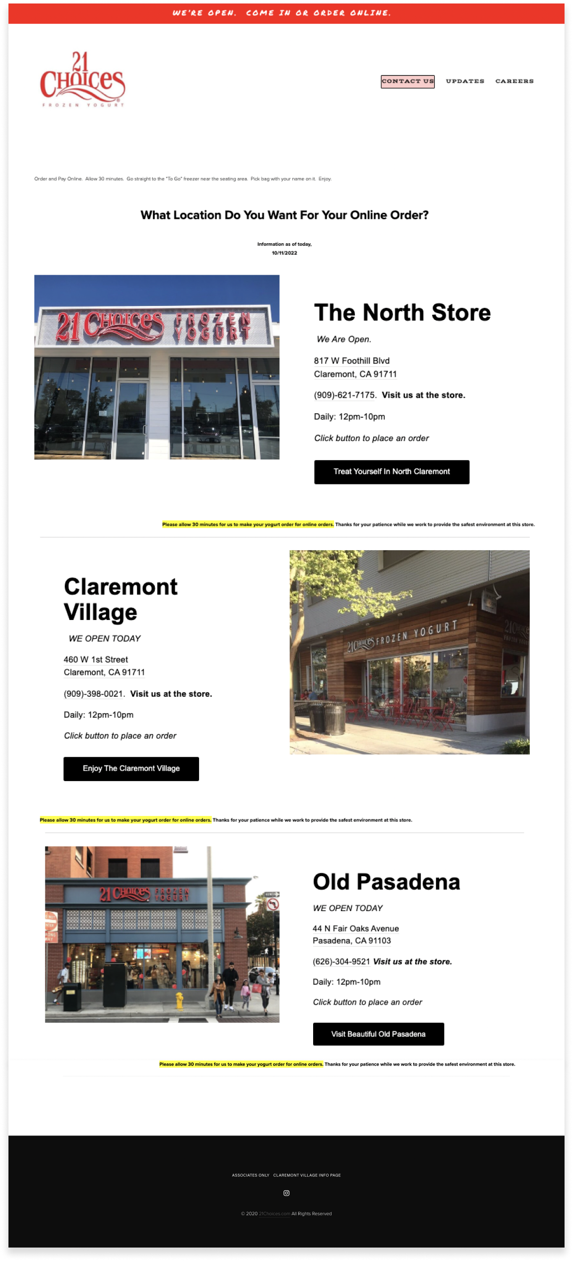
For this assignment, I chose to redesign the 21 Choices website, specifically the online order location selection page. 21 Choices is a family-owned frozen yogurt store located in Southern California. I chose this webpage because as someone who frequently goes to 21 Choices (it's personally one of my favorite dessert shops!), I am annoyed/saddened by how poor the website design is in comparison to their sweet treats.
usability analysis
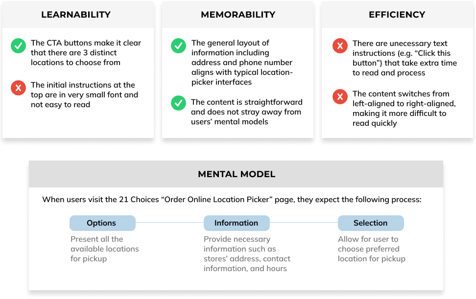
First, I conducted a usability analysis on the webpage using the three criteria of learnability, memorability, and efficiency.
ACCESSIBILITY
Then, I used the WAVE Accessbility program, which identified a few issues with the accessbility as well.
Heading: The heading sizes and components on the webpage are inconsistent and highly varied. This can be confusing and reduces the semantic and visual meaning and structure to the page.
Empty button: There are 2 empty buttons on the site, which are buttons with no text on them to indicate where the button leads to. However, I do not agree with this evaluation because I could not find the empty buttons.
Alt text: Several images had "suspicious" or "non-descriptive" alternate text descriptions. For example, the Claremont store image simply had the alt text "Claremont," which is vague. This negatively impacts accessbility for visually impaired people, such as blind users who rely on alt text to experience images.
02. Visual Redesign
LOW-FIDELITY WIREFRAMING
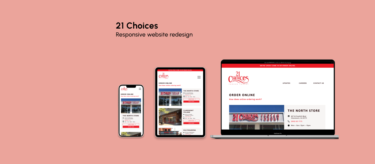
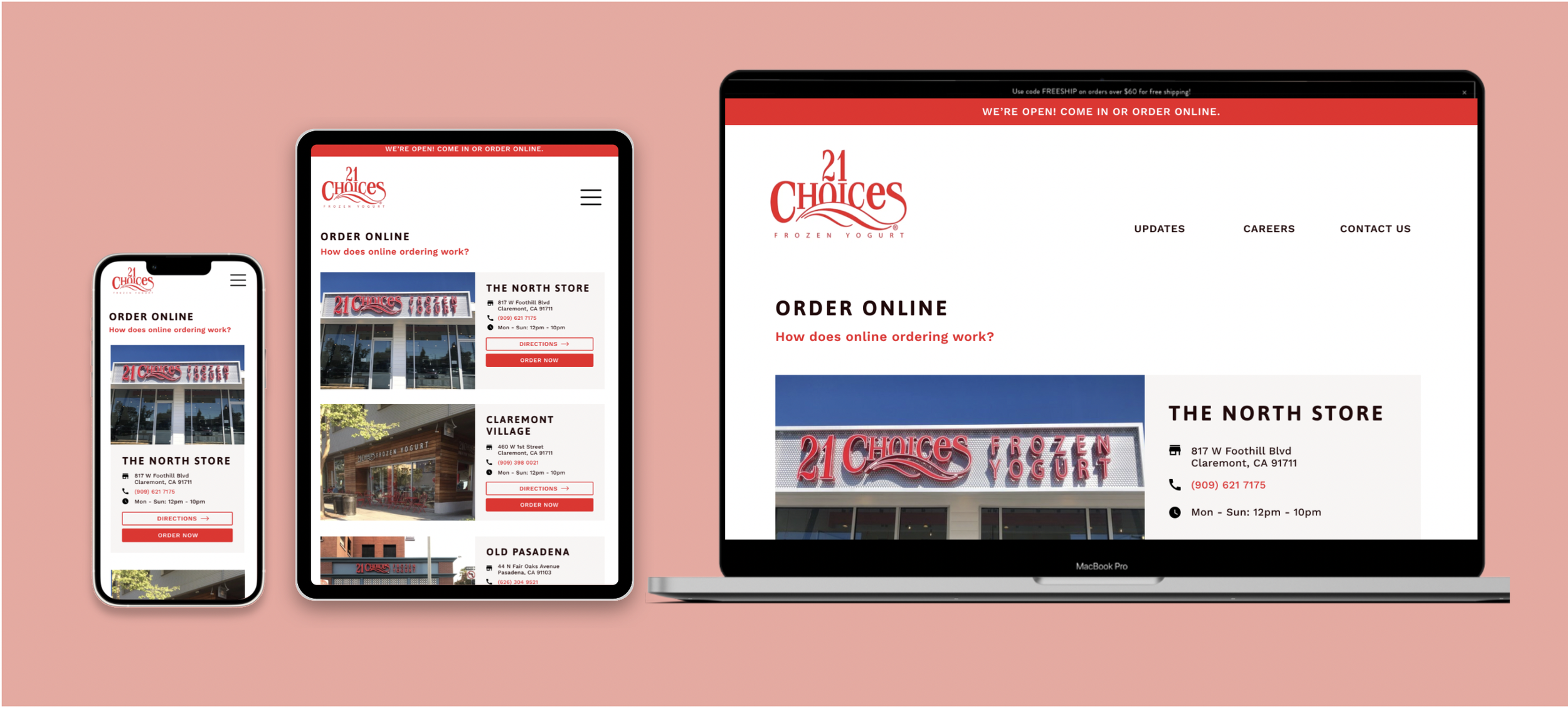
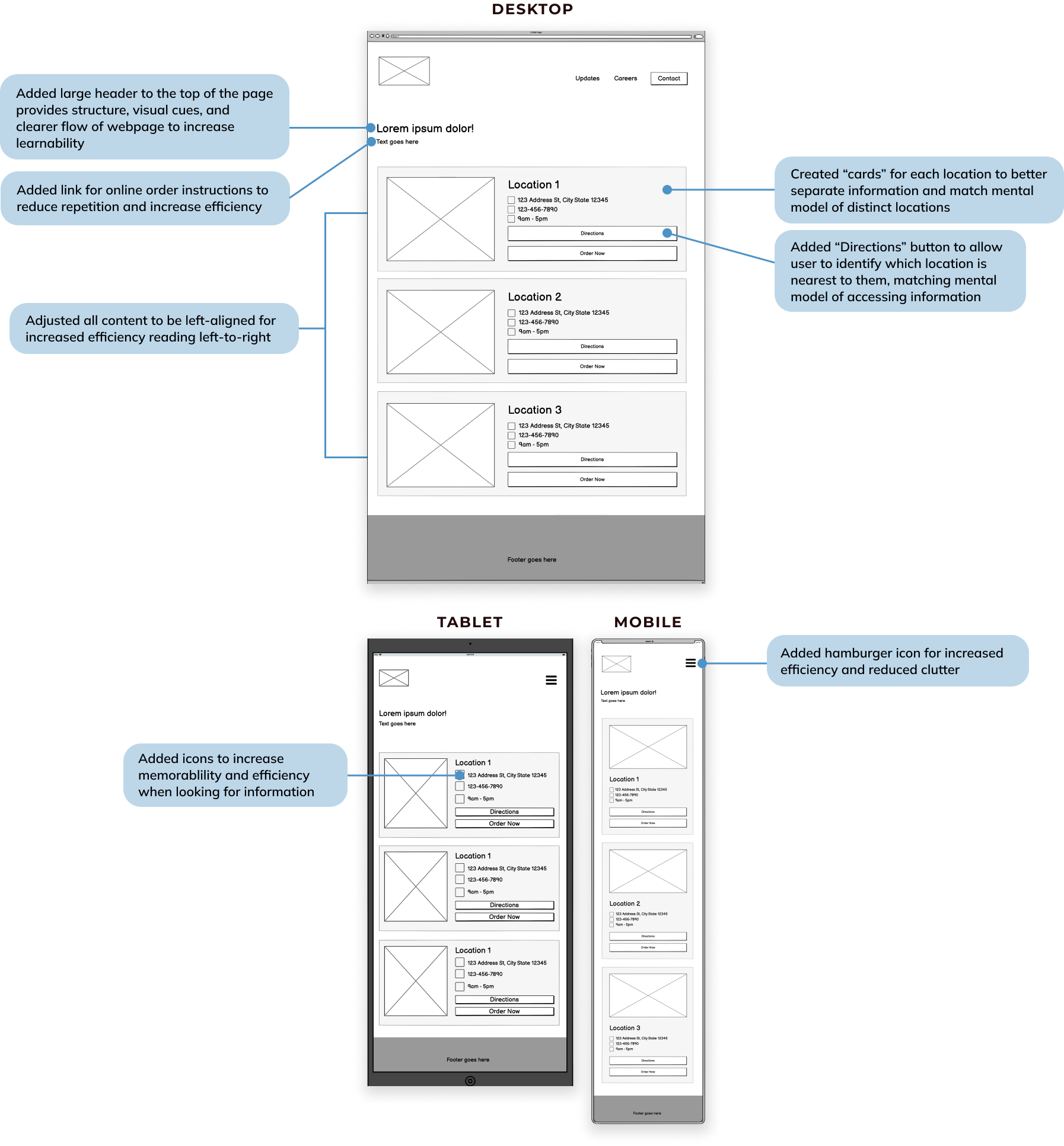
Based on the usability and accessibility analyses, I used Balsamiq to create 3 low-fidelity wireframes (for desktop, tablet, and mobile) outlining how the website could be improved.
visual design style guide
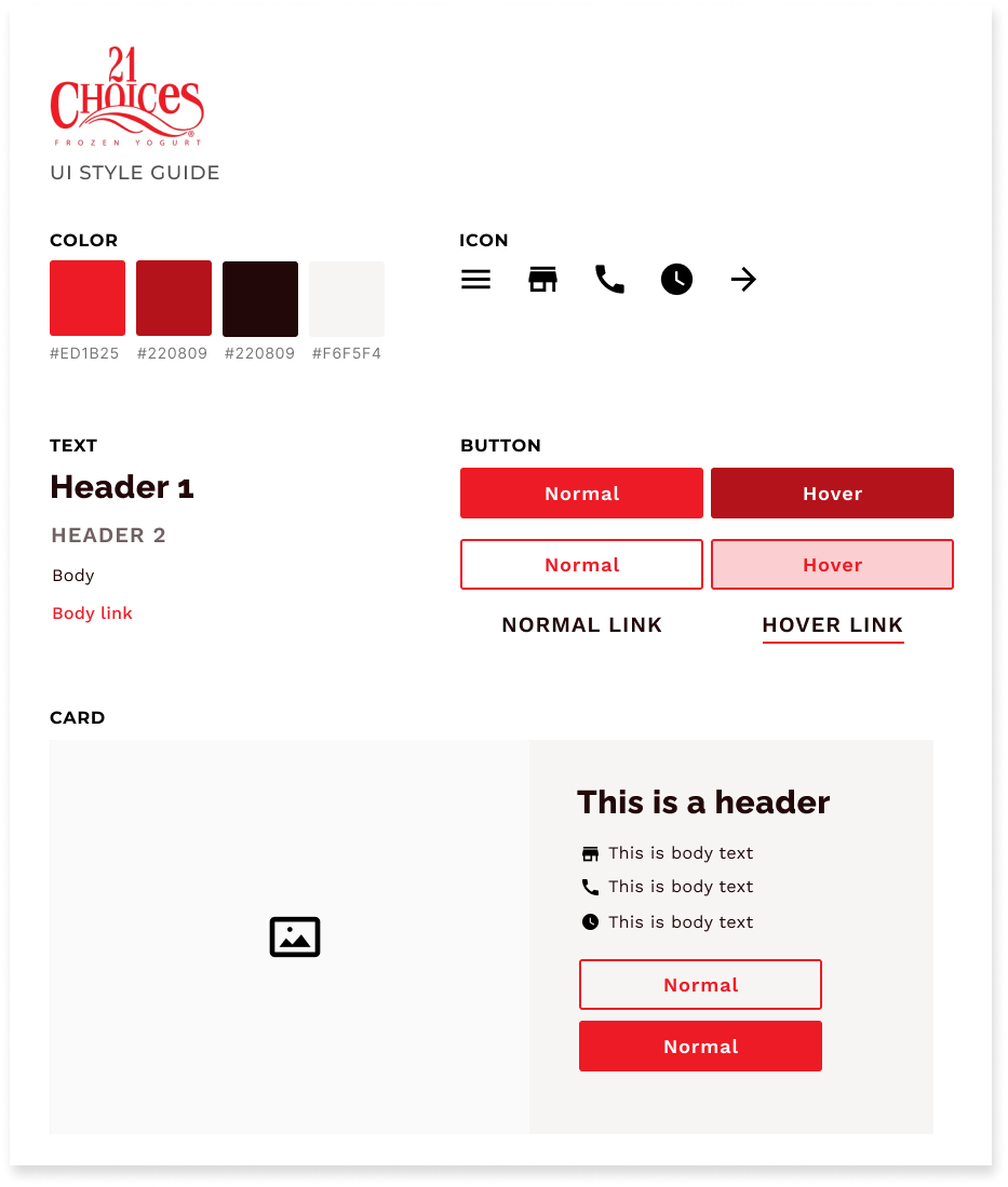
I also created a visual design style guide, adhering to the company’s current color scheme and brand identity, to increase consistency and cohesion for the high-fidelity prototypes.
high-fidelity prototyping
I then used Figma to create high-fidelity prototypes based on the low-fidelity wireframes.

03. Responsive Redesign
Finally, I used HTML and CSS to recreate the 21 Choices website according to the high-fidelity prototypes. Buttons and navigational elements are replaced with dummy elements.