
Capsule App
overview
For this project, I collaborated with 3 other students to design an interactive interface for an emerging startup. Our team went through the full process of mocking up a solution to the startup's concept. This project is split into four parts to exemplify an iterative design process flow: (1) sketching ideas of the interface, (2) creating an interactive, high-fidelity prototype, (3) conducting user testing on a final, revised prototype, and (4) contacting the start up.
Timeline
October 2022 - November 2022
SKILLS
Sketching, Lo-Fi Wireframing, Hi-Fi Prototyping, User Interviews, Iterative Design
00. Goal
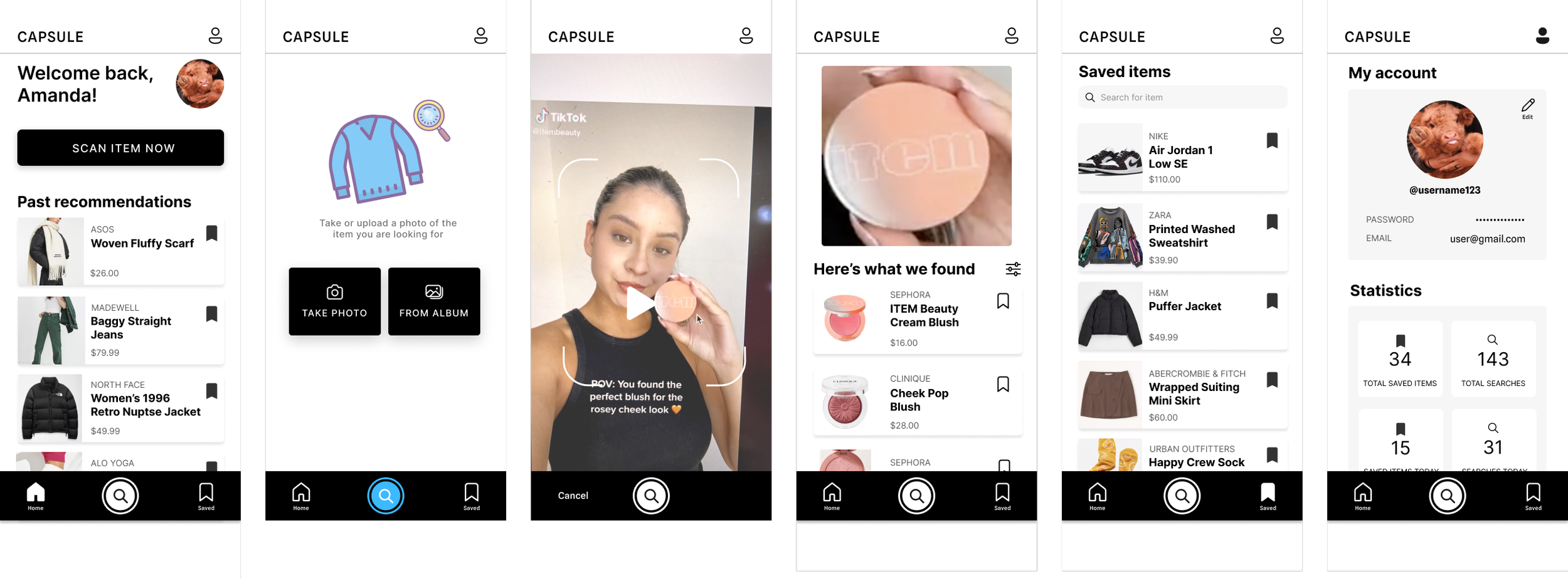
How can we create an app that allows users to upload photos of things they want to shop for?
01. Sketching & Wireframing
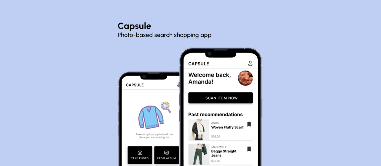
The startup that we chose to design a prototype for is called CAPSULE. The idea behind this start up is to upload or take a photo of an item to a platform, then receive links to purchase this item.
We thought the best interface for this goal would be to design a mobile app because phones normally have cameras which would make it easy to take a photo, and they have photo albums where the users can chose a photo to upload.
The users that would be impacted by our interface would be the normal everyday consumers because this service is targeted to people who want to buy certain items. Thus, this app would cater to users who want to purchase an item that they have seen before.
sketching
Our group first individually brainstormed 4 possible designs for our startup's app. We each sketched out the 3 main screens--home, find item, and results--on pen and paper.
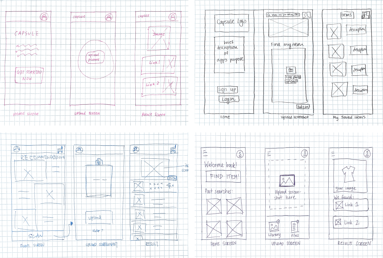
After our discussion, we combined the sketches through the following design choices:
For the home page we decided to make the home screen not a login screen which a user may encounter when they first get the app. Instead we decided to make the home page that the user would expect to see if they had used the app before.
The designs for the upload screen and the results screen were relatively similar across all the sketches so we refined those sketches to make them more cohesive.
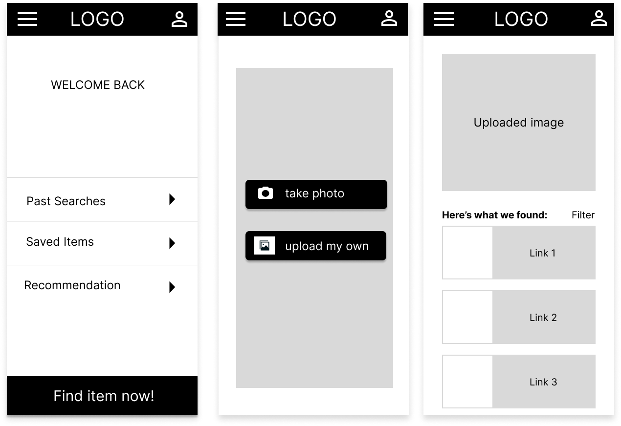
02. Iteration
This was the first version of our mockup:

We received the following feedback from the mockup critique:
In the home page, the "FIND ITEM" verbiage was not conducive to what the button was trying to do.
Allow for accessibility to take/upload a picture no matter where they are in the app (like TikTok's plus button at the bottom bar)
The icons on the navbar should change color when the user is actively on that page. For example, the home page icon would be a different color when the users are on the home page of the app.
The save button is slightly too small to easily press on it in the mobile screen.
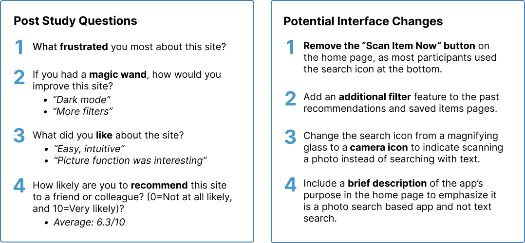
03. User Testing
Through usertesting.com, we gathered the insights, confusions, and opinions of 3 participants using an unmoderated usability test. We analyzed and synthesized the findings to produce the following insights:
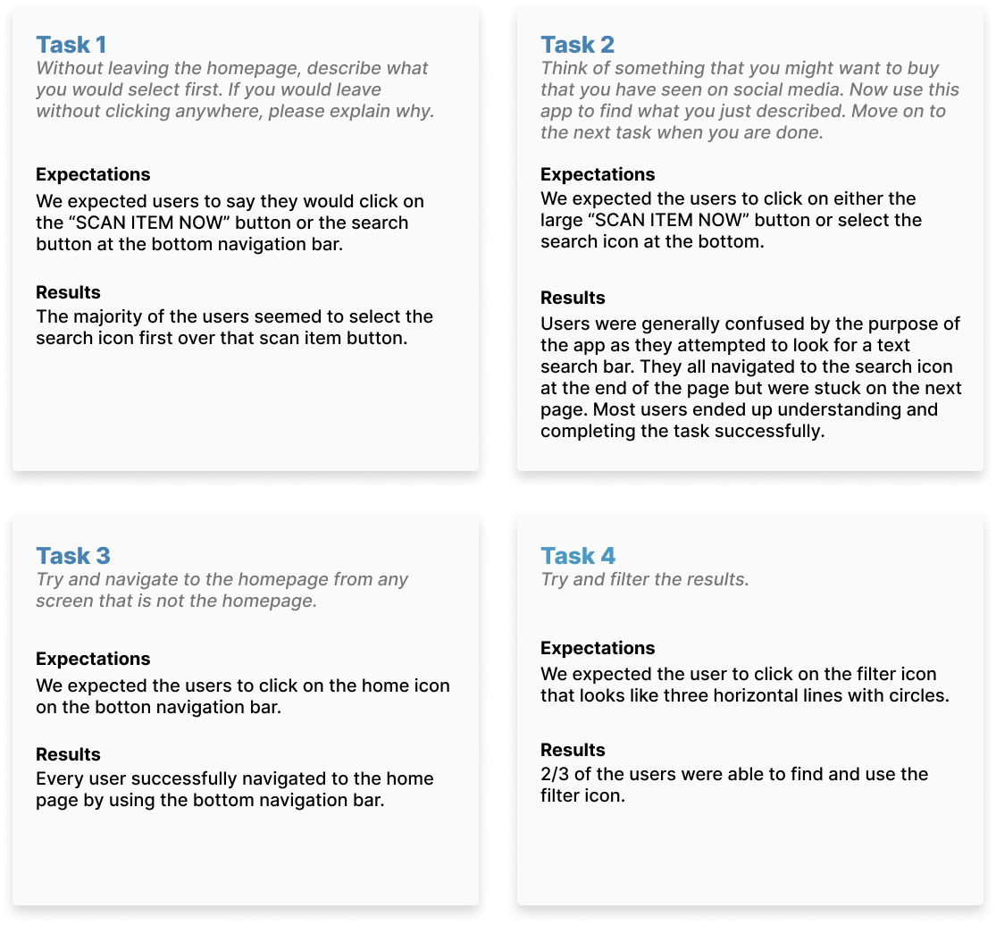
Based on the task results and the answers from the post-study questions, we brainstormed 4 potential design changes we would make in a future iteration.